If there’s anything I like almost as much as ‘real robot’ anime, it’s ‘real samurai’ anime and manga. What I mean by ‘real samurai’ is that the swordsmen and swordplay in the subject works are for the most part portrayed with a realistic aesthetic; the same way FLAG is real robot to Shin Mazinger Z‘s super robot, as is Sword of the Stranger is ‘real samurai’ to Rurouni Kenshin (TV)’s ‘super samurai.’ ‘Super samurai’ shows are distinguished by their extensive use of shounen tropes, particularly called out attacks that result in colorful energy explosions, among other special powers. While I don’t think any of these are bad (After all I like Sengoku Basara), I have a greater appreciation for samurai anime and manga that indulges perhaps the same things, though very differently. Here in this post I present two of my favorite samurai manga: Shigurui and Vagabond.
I’m not going to get into the stories, characters, and other elements of these books. While these are all interesting (they are very interesting) I’m going to present here a small (and subdued) sample of the drawings. In my opinion these are some of the best-illustrated panels in manga. The lines, the detail, the construction of each panel is well thought out and rendered diligently and industriously (and in Shigurui’s case, gratuitously). In Vagabond there isn’t much fetishization of specific techniques. The protagonist, a fictional version of Miyamoto Musashi is known for his Ni Ten Ichi Ryu technique which involves the wielding of two swords. The moment wherein he felt the necessity to pull the other sword (to fight a chain-and-sickle expert) is largely portrayed without adornment or added significance. This actually works very well. The swordsmanship seems more pure and spiritual (even when savage and beastly) bereft of technique/attack fetishization. As a contrast, Shigurui is a tour-de-force of arcane swordsmanship. Some techniques are well-kept secrets by their originators, legends in their own right. The execution of the swordplay is quite fantastic and unrealistic, but the portrayal is dedicated to plausibility and works very well. Back in the day I had hoped Rurouni Kenshin (TV) would’ve been done this way instead of the overall silliness I’ve seen, but I did get my wish when I saw the OVA prequel which was quite sublime. That one felt very much like Vagabond, while Battousai’s training and swordsmanship was given plenty of attention, no techniques were mentioned by name, much less portrayed. So how does all this look like in a page?
Vagabond
In this image take note of the extreme foreshortening used to draw Musashi’s foot and leg which is closer to the ‘eye’ of the reader relative to the man being chased. The ink blot technique to draw the blood on the head complements the inky-dark forest around the fighters.
Now check out the work put in the bridge. Look at all that hatching. Look at all the whorls on the wooden planks and posts. It’s insane.
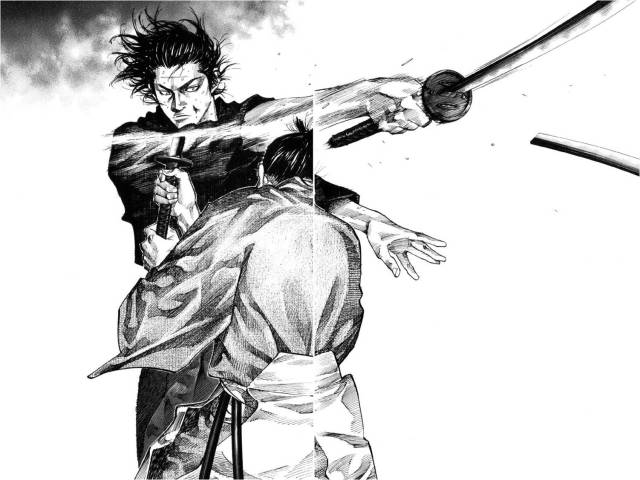
See the sense of proportion in the anatomy, the character designs do not look outlandish or inhuman. Even the action poses are not exaggerated (instead look at Musashi’s free hand, and how it’s functional in maintaining the balance of a sword-swinging body). The treatment of light and shadow is exemplary, as is the work on wrinkles and drapery. Also note the absence of action lines to depict motion. Instead of action lines there is effective use of white space which highlights the dramatic foreshortening done on Musashi’s sword and swordarm (not easy to do, especially in this fast motion), as well as the aforementioned wrinkles and drapery and light and shadow on the various articles of clothing. To say something about consistency, The first image is from chapter 5, the image from the top of the post is from chapter 227. At present there are around 269 chapters published. The quality is rock solid.
Shigurui
While the wrinkles and drapery, light and shadow, and detail on the wooden floor aren’t on the same level as those in Vagabond, the detail is still quite impressive. Also what’s notable is the construction of the scene, the drama — the potent stances of the combatants brimming with violence. The single vanishing point perspective used leads to some imbalance in the depiction of the spectators — which tells me just how ambitious the panel is. See how Kogan’s sword hand is hidden in his sleeve. It’s not cutting corners (more difficult hands were illustrated in this panel), it’s a kind of touch that the construction allows you to take note of.
Very difficult foreshoretening used here. The from above view requires an excellent sense of depth and proportion. The attack is illustrated with high drama, with the billowing hair and head-scarf. Also note the non-use of action lines, instead going for the more difficult use of sword after-images. Note that the sword is slashing slightly diagonally downwards, you can tell by the angle of the wrist and the sword hilt guard. It doesn’t totally work, but again the degree of difficulty is stupendous.
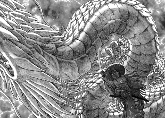
Here is another image with foreshortening, this time from a ‘worm’s eye view.’ The thing to note here is not only Gennosuke’s foreshortened figure, but also the coils and limbs of the dragon as well. Lots of good hatch work on the shadows though it would take context for the reader to get that the background is lightning against the rainclouds. This is not a literal dragon in the narrative, only a manifestation of the dragon-like spirit of the swordsman. Part of the thrill in watching swordplay or reading samurai manga is the payoff of the actual cutting down of opponents. In both manga there are copious amounts of blood and the violence cuts deep. In Shigurui‘s case, cuts through bone and spills guts everywhere. I find it ridiculous watching shows like He-Man who wielded a huge sword never cut anyone down with it. I felt I was being made stupid as a child. Good thing there are manga like these that remind you that when you swing a sword with power and technique, very bad things happen to your enemies.
Further Reading
Shigurui on Wikipedia (beware spoilers) [->]
Vagabond on Wikipedia (beware spoilers) [->]
What the heck are real robots and super robots, and how the frick can I tell the difference? (Vendredi 2009/04/20)
Notes:
Fans of Shigurui will notice that I withheld sharing the truly distinctive elements of the manga (stylistically, and visually)
The mangaka of Vagabond is Inoue Takehiko, who also did the wonderful Slam Dunk.
I may not be the most reliable evaluator of drawing technique, as I don’t even draw anymore. But I used to do so a lot, from childhood to high school and have studied a number of Burne Hogarth books on drawing [->]


Great, now you’re a fuckin art specialist, is there anything you don’t know, goddammit? Anyway, very excellent post highlighting excellent manga with excellent art.
It is just a little funny that you place Vagabond as a ‘real samurai’ story, because as real as they are able to make it feel, Musashi Miyamoto was the ultimate super samurai, with all the ridiculous legendary stuff surrounding him, and let’s face it, samurai probably weren’t all in tuned with the spirit and manly and awesome as fuck as they are represented by romanticized Japanese history (which is why Shigurui seeks to depict them all as the unlikable fucks they were)
However, if we’re comparing real samurai to real robot, even a REALLY real robot show like Flag, it of course is still expected that things aren’t actually realistic, but just feel that way.
Thanks, but you give me too much credit.
A realistic aesthetic may contain many fantastic elements; it’s the attempt at or dedication to plausibility or groundedness that distinguish the fantasy to the out-and-out fantasy of Basilisk or Ninja Scroll with their monsters and what not.
That said, I know very little about art theory, so you’d notice that I don’t use the word ‘art’ here. Instead I use ‘drawings’ and ‘illustrations’ which I know a little of, though I’m neither trained or schooled in them.
I can comment on some drawing techniques or other details, but not really on abstractions or style.
Something I thought of, regarding the detailed art styles — typically, the closer an illustration is to “realistic,” the more alienated the reader is from it. The fewer details in a character or a place, the easier it is for a reader to relate — hence stuff like the main character of a manga being very simplified and the villains and love interests being very realistic. So it’s possible the realism also acts as a distancing effect, keeping the reader from connecting with the characters in the same way we might in a Bleach or a Kenshin. Which calls back to digitalboy’s “unlikable fucks” — even if we like someone, we’re not connected to them in the same way, which creates a different mood. It’s like a Kubrick movie.
I’m pulling all the art theory stuff from Scott McCloud.
Very interesting, though I’m not very confident in discussing this due to my ignorance of art theory.
I don’t think I understand what this alienation you speak of in relation to a highly life-like illustration in a sequential picture narrative. Please say more.
I guess he meant that with fewer details, the readers/audience could insert some of their own details taken from their own selves; thus, they could consider the story as also their own.
It could be, could be. But do give examples of how this works.
gloval’s got it.
My default example is usually anything in the Leiji-verse. The main characters are usually pretty simply drawn, while side characters (like Maetel, mmm, Maetel) are well-detailed — at least, comparatively. It’s McCloud describes it as a way for the audience to identify with the simplified character, because he/she could be almost anyone, including them.
He creates his own example, by switching to a hyper-realistic style for one panel and claiming, “Now, would you be as able to identify with me if I looked like this all the time?”
the art is amazing. my question is: do these mangaka do research to draw this stuff? i mean, i would think they must sit down at dojos and watch people fight, at the very least…
I can’t answer your question with any authority, but my speculation is yes. It shouldn’t be too difficult considering they may have been immersed in this subculture at a very early age. They may have taken up the martial arts themselves. I mean, even I have — so it isn’t difficult to imagine that they’re otaku for these at all.
Wow, I wish The Ravages of Time were drawn as stylish as these. I think you’ve done fantastic job analysing each panels, really brings out the mangaka’s strengths in drawing. I wonder if you’ve watched Shigurui the anime. It’s fantastic. Usually a lot of manga’s gritty details and intensity are lost when translated into anime, but Madhouse somehow managed take exploit the animated medium in its own way, and produced something so intense and chilling.
Thanks a lot. I don’t think I can discuss ‘art’ in terms of style and concept the way you or animekritik, or even digiboy do, but I can take on the human figure in action and basic scene construction. Maybe if you post more often (hint, hint) I’ll learn quicker.
Now that I’m up to date with Shigurui manga, I’ll be hunting down the anime. I really have to thank Owen for sharing this favorite of his, and he too tells me that the adaptation is solid.
I have to say, from these small snapshots Vagabond looks much more appealing than Shigurui. I’m not not one to shy away from graphic violence (I do read Gantz) but something just seems off about the art. Perhaps it would be better within context, but I can’t for the life of me tell what’s going on in the last panel.
To be fair, I kept myself from showing the most distinctive bits of Shigurui. Having said that however, I think Vagabond’s illustrations are superior in almost every way: from the ‘weight’ of the line used, the temerity to use something akin to ‘super deformity’ but not exactly in some places, the action of hair during movement (see above images: V3 vs. S2), naked women, to shortcuts used (Vagabond uses ‘loose’ lines, Shigurui omits eyes).
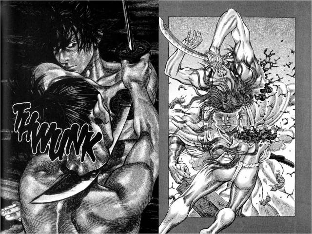
In the last panel (Shigurui) the swordsman slices an opponent in half with a horizontal slash (left swordhand swinging outward). The opponent literally explodes with all his internal organs spraying about.
Shigurui is into gore. The battle/duel that this panel is part of is freaking awesome. Un-fucking-believable.
LULZ, so is Christopher Fucking Walken.
While I can appreciate how much effort and talent goes into making the type of art you posted, I can never manage to make myself like very realistic illustration of manga. It always seems way too fussy and distracting.
What kind of art styles do you prefer? I’d appreciate examples, so I can probe the distraction factor, which I find quite interesting.
I’m probably going to get laughed at, but for the most enjoyable manga art I’ve seen is the last volume of Tokyo Babylon. It had all of CLAMP’s usual problems with anatomy and the characters can seen too two-dimensional, but at the same time the clean arrangement of panels and the very striking use of positive and negative space makes it very likable without being distracting. And while I can get why someone might really like a more realistic looking manga, I find that I need simpler more stylized art to focus my attention to the important bits rather than spending time admiring the crosshatching on a character’s left buttock.
Examples:
1
2
3
Your ‘striking use of positive and negative space’ is not apparent in the examples. Also, image #3 is hard for me to praise because it’s basically inking over a photograph (city-scape image).
I’ve no problems with CLAMP’s stylized character design, though it is not my preference.
The examples I gave, see Vagabond’s action image (example #3) as great use of white space. A lesser manga would use a bunch of action lines here. Inoue Takehiko has great balance in his drawing throughout the manga. The details are there for those who like it, but never to the expense of the composition of the scene.
A great example of this is Slam Dunk, a very realistically drawn basketball manga, with stylized super-deformity for comedic bits, and has all the effective use of positive and negative space you could want.
(and none of the images I provided have messy pane arrangement).
Funny you say this, because CLAMP’s work on Tsubasa is some of the most confusing manga art I’ve ever seen.
Have to agree with Inoue Takehiko–he is my favorite mangaka. There was a critique I’ve read before about Slam Dunk, that he’d copy the moves from NBA magazines. Assuming that’s the case, I think another plus on his side is that he knows “how” to work his way around his illustrations. It’s not just about the skills in drawing but how he directs which image goes with what that makes the panels more striking. I think the said skill applies in Vagabond, too.
Him copying from photographs of NBA action is great trivia, and is quite awesome. That’s why the manga looks so great. Having been an NBA fan for over a decade, I can appreciate the iconic poses in the manga.
Note that this photorealism actually makes the manga unrealistic, since no way can asian high schoolers can have those moves.
I suddenly am gripped by an almost palpable impulse to do another chart on “real samurai” vs. “super samurai”… actually, in a similar vein to real vs. super robot anime, a big difference is in the whole attention paid to special attacks in “super” shows, while “real” shows often will try to incorporate some idea of (dueling) tactics – and often will choose to show, rather than outright say, any sort of special ploys or tricks.
A third title that would probably go very well with what you’ve listed is Blade of the Immortal (the manga, at least; I’m hesistant to recommend the Bee Train adaptation) – which falls somewhere in-between as the premise is, of course, that the main character is nigh-immortal.
As to animekritik’s comment, I believe most of the artists who do manga like this actually come from more classical art roots – Hiroaki Samura of Blade of the Immortal, for example, had a lot of formal art training (and it shows!).
As you noted research isn’t particularly difficult in Japan given the prevalence of kendo, naginata-do, and kyudo (all modern martial arts), along with a handful of koryu schools that actually have tried to preserve the exact same martial techniques, despite their obsolesence – there’s a wealth of sources available. Europe by contrast pretty much only has historical texts to go by – you won’t find any living German masters of the longsword, for example, only recreationists.
Should you do the chart, KEIKAKU DOORI. LOL
Ok, you’ve piqued my interest in Blade of the Immortal manga.
‘Real’ shows/manga take long dramatic poses during duels when ‘supers’ would slot their ki charging and what not. The ‘real’ would instead display a totemic animal representing the fighting spirit of the swordsman, just as Shigurui shows above.
*writes names of manga in notebook & then closes it*
Holy Sh*t that was some awesome and brutal artwork! I just hope the characters and plot can match the art. I’m a big fan of Akira Kurosawa’s work, and these manga look to be a great intro into samurai manga.
As for Rurouni Kenshin, if that was the “super robot” of the samurai genre, then I am in love w/ “super samurai”. The prequel and the first 2 seasons are peerless, in their own separate ways.
You’re in for a treat! Vagabond is a very good fictional biography of Miyamoto Musashi, while Shigurui is a story that is as brutal, visceral, and dangerously beautiful as its illustrations.
Pingback: In the mood for blood: notes on the atmosphere in Shigurui « We Remember Love
Pingback: Cutting Through a Forest of Swords: a Survey of Swordplay Anime « We Remember Love